Visualization Crash course
Here we mentioned the very basics for the visualization tools, just enough to understand how Pandas plotting and Seaborn are built on top of Matplotlib.
Matplotlib
It is common to create an alias for Matplotlib as plt and that will in this way:
Now, since Jupyter notebooks is the most common tool it is important to mentione that we need to add an extra line after importing matplotlib.pyplot. so a common import session of a file will look like:
Simple plot
To simple plot we can use plot(x,y) but in jupyter notbooks we can add a ";" at the end so the matplotlib text wont be display
in a .py file we will need to add
plt.show()in order to see the graph
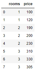
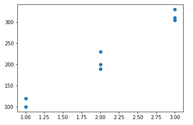
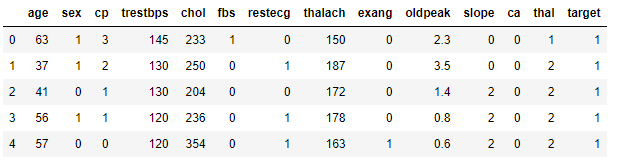
we will create a DataFrame that we can use to plot
If we use the normal plot this will display some straight line but if we use the scatter we will have dots in the x and Y points
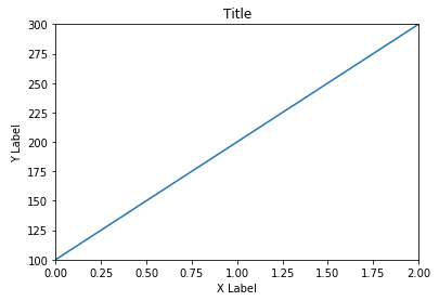
Adding title and name to the axis
- we draw the plot
plt.plot(x,y) - we put the title
plt.title('title') - we name the axis
plt.xlabel('X Label'), plt.ylabel('Y Label')
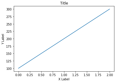
Adding limits or changing the axis scale
We can limit or expand the limit of the graphic, in this case we want the previous plot axis to start 0 for X and 100 for Y and finish at 2 for X and 30 for Y.
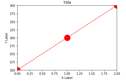
Changing the markers
We can change the color and style of the line, but also we can change the style of the markets
Seaborn
Seaborn is a library on top of Matplotlib that allow the creation of different charts and graphics with less code
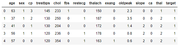
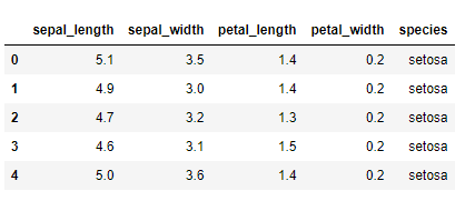
for the examples we will use a Csv file
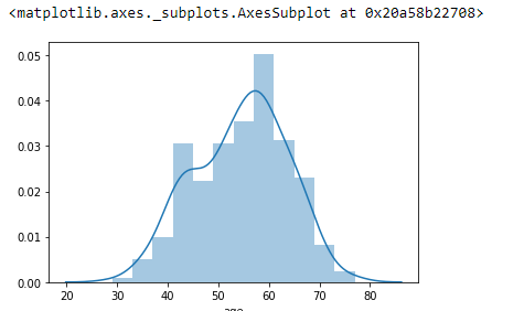
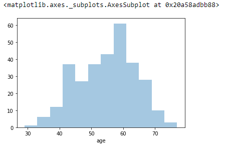
Distribution plots
Resizing and modify seaborn plots
for resizing
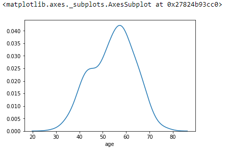
to remove the KDE (Kernel Density Estimates)
similar to remove the histogram
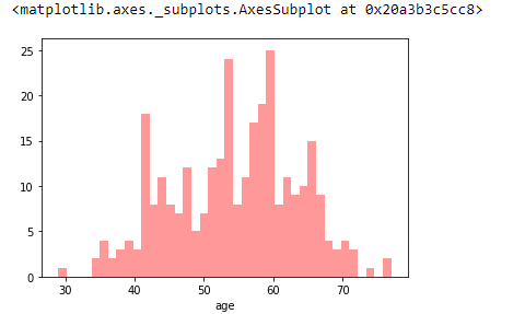
to change the color
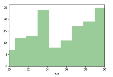
we can limit the axis in seaborn as we limit the axis in matplotlib
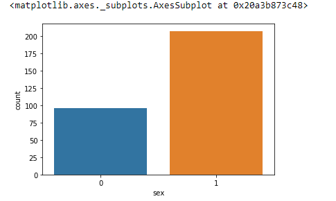
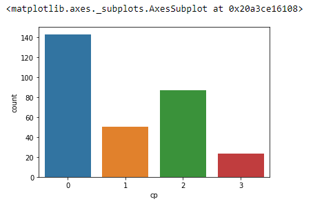
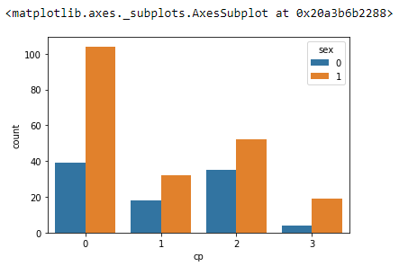
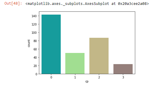
Count plot
From the same csv file
and we can use hue to add more information
we can change the color ( there are predefine color colormaps)
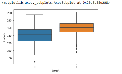
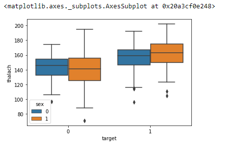
Box Plot
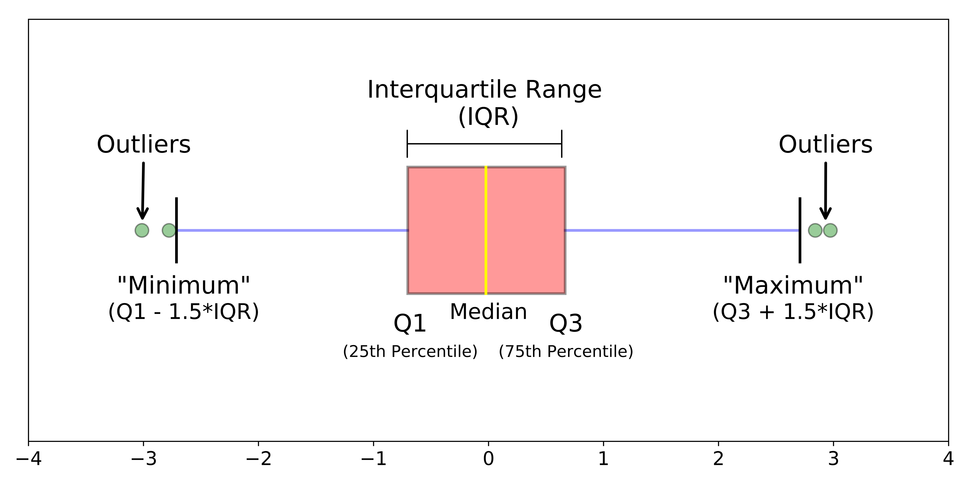
and in the same way that with count plots we can use the hue to add more information to the Box plot
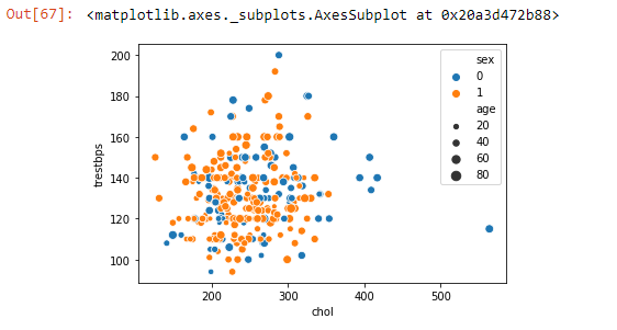
Scatter plot
This kind of plot is use to display the relationship between two continuous features
we can use the hue and size to add extra dimension, and use palette to change the color more info
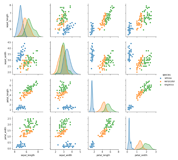
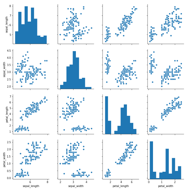
Pairplots
Pairplots perform scatterplots and histograms for every single column in your data set. This means it could be a huge plot for large datasets! Use with caution, as it could take a long time for large datasets and the figures could be too small! more info
or just show the KDEs instead of histograms